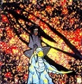
So these are referencing the image at the top of the page here
https://www.ubiqlife.com/journal/index. ... ans-vault/
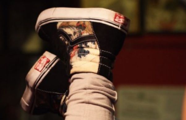
Sk8-hi's are pretty sweet other than the giant UBIQ logo kind of taking over. The right panels definitely look the best, with the wave coming up from the heel of the shoe. Left panels feel like they lined it up just so the UBIQ flag could run alongside the eyerow, w hich is kind of cool until you see how it cropped out some of the more interesting aspects of the image (like half of the dragon's face). Should've put the focus on the left panels on the dragon! And in the pair the girl is wearing, the samurai's sk8-hi's are cropped out! If I get a pair, I better have a full on image of a samurai in sk8-hi's. haha
Same applies for the Era's, but I also wish the graphic on the toe wasn't just cropped straight out of the middle of the image. It would've been way more interesting to have the left shoe cropped more on the left, focusing on the samurai dude (and showing his darn sk8-hi's!), and the right shoe cropped more to the right, focusing on that awesome dragon! Plus, it'd show off the full vibe of the image more. Cropping straight from the middle seems sloppy to me when there's so much else guiding the eye around that image. I guess they wanted to show off that stack of Vans boxes... haha
Seems like they felt the need to focus too much on the branding in the image instead of the more interesting aspects of it.
So can the "originals" line just be any version of any model now? Are these like "originals" of syndicate sk8-hi's or something?
Geez, I sound critical. haha
Hello, my name is Kyle and I'm addicted to Vans. I'm a size 9.5 or 10.
Looking for Supreme Disruptive Era's (any color, but especially teal), Supreme dark teal pebbled leather chukka, navy GR Zero Lo's...
@IAmRocketKyle on the instagramz.